UI/UX Designer
IAA, Inc.
IAA, Inc. provides in-person and digital auction services to buyers worldwide for purchasing automobiles and other vehicles. The goal of the flagship IAA buyer mobile-app redesign was two-prong: 1) To create a high-quality user experience that will help the world’s leading salvage auto suppliers locate, purchase, and transport high volumes of vehicles, and 2) Create an intuitive, familiar platform for smaller, lower-volume buyers to engage in the sales process.
My role as a UI/UX Designer was to own the redesign of the end-to-end native mobile experience (iOS and Android) and to orchestrate all design activities for ensuring smooth transition and adoption of the new platform.
Key Opportunities
Core UI and functionality improvements
IAA’s Buyer App effectively served its users for nearly a decade by addressing the core needs of their users: Provide a native iOS and Android platform for finding and bidding on vehicles. Over time, user needs and technology evolved which created a ripe opportunity for re-imagining and re-delivering the buyer experience.
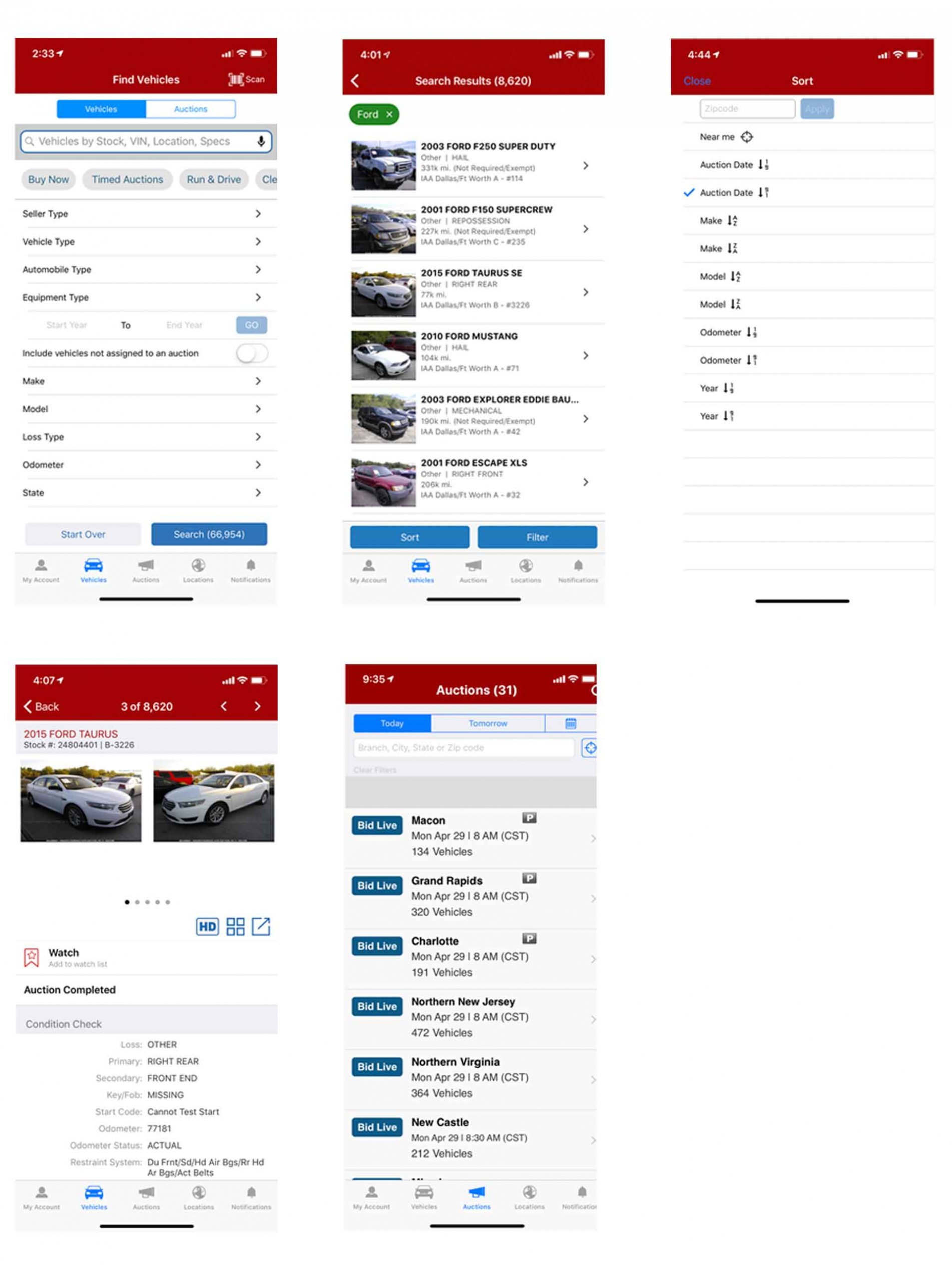
Figure 1.0. Pre-redesign screenshots of several core pages including vehicle search filter, search results, sort, vehicle details, and auction listing page
My Account info architecture update and reorganization
The My Account page houses several different types of robustly focused content, including access to controls for manipulating use settings, pre and post-sale auction lists, and historical purchase data. There were opportunities for refining the organization of this content to improve findability, and updating the UI to be closely aligned with usability guidelines and well recognized design patterns.
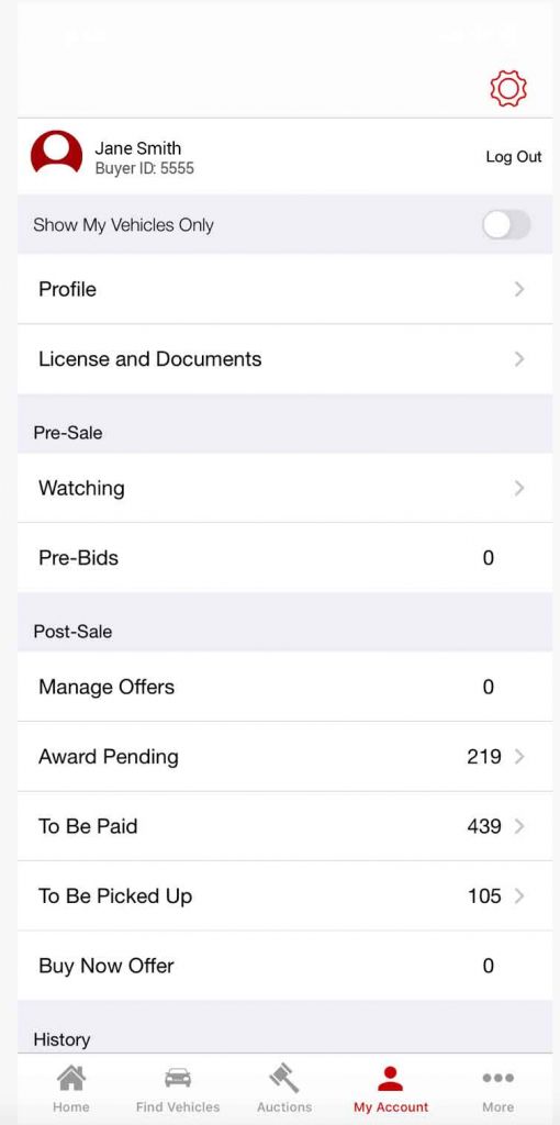
Figure 2.0. Pre-redesign screenshot of the My Account page
User onboarding
One of IAA’s primary goals with the Buyer App has always been to provide an intuitive UI for the end-to-end buying journey in support its users with varying levels of technical proficiency. As its market and customer base grew over the years, its buyer features and functionality evolved respectively; creating the opportunity for making buyers aware of the cutting-edge technology available to them via the app, and educating them on how these features/functionality may be useful to them. IAA embraced this opportunity and set its sights on designing a focused and informative onboarding experience for its users.
Actions & Results
I like to think of the IAA Buyer app redesign as a treasure hunt so-to-speak. We had our map, or strategy, which we formed around the business objectives. It was then up to me to cast a guiding light on the path to lead the team through a meaningful and sometimes arduous journey of design activities in order to discover the treasure: An effective, easy-to-use, and enjoyable product that was created from data-driven design decisions.
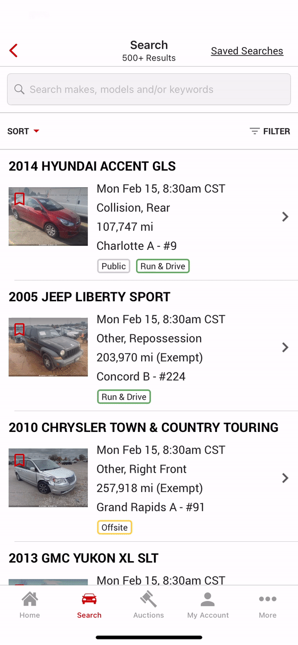
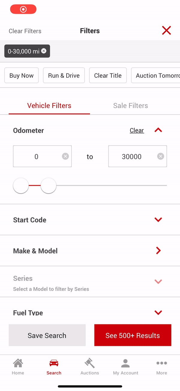
Vehicle search enhancements
Quantitative and qualitative data gathered via user surveys and interviews respectively suggested that users desired a more robust and flexible search experience so that they can easily pinpoint the vehicles they are looking for. Based on our users’ feedback, we updated the following areas of the vehicle search UX and and UI:
- Information architecture update – Categorized the filter groupings into parent filter groupings, Vehicle filters and Sale Filters, so that users can easily find and set the filters they are looking for.
- New filter additions – Added several filters including for Distance and New Inventory filters so that the user could filter out older inventory that was far from their location.
- Interaction type updates – Updated interaction types of several pre-existing filters, such as Odometer, so that the filter UI was were easier to use and more flexible for returning results closely aligned to the user’s needs.
- Visual design enhancements – With the addition of optimized content and page functionality, we took the opportunity to enhance the visual design of the page, including increasing the hit areas of interactive elements so that they are easier to activate, and upgrading text treatment of the filter groupings so that they are more easily scannable.
Figure 3.0. Redesigned vehicle search experience illustrating the new Search Results and Filter UI.
- Save search functionality – User can now save search criteria so that they can easily execute repeated searches without having to repeatedly go to the filter each time and manually set filter values.
- Saved Searches page – The Saved Searches page is highly visible easily accessible from several locations within the app, including the app landing page, search panel, and Search Results.
Figure 4.0. Illustration showing the newly implemented Save Search functionality from the filter and recalling a previously saved search from the Saved Searches page.
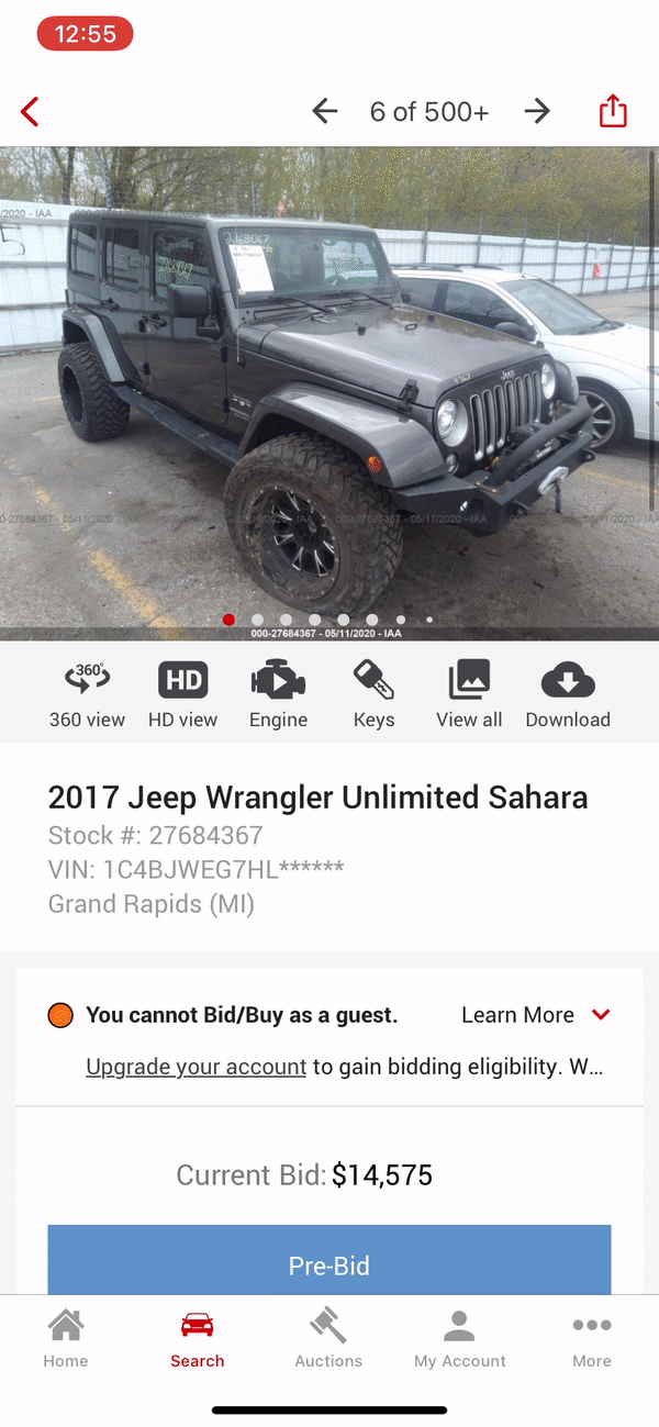
Product/vehicle details enhancements
IAA curates a gamut of media for each vehicle in its inventory to help buyers in making their purchasing decisions. Users need to be made aware of these different types of media and understand how they may be of value to them. Additionally, users need to be given clear access to the same so that they can easily consume the content. Here’s how we accomplished these objectives:
- Intuitive icon creation and labeling – It was challenging to find an icon set that represented the media that these icons linked to. We therefore needed to create more intuitive custom icons and pair them with meaningful and concise labels so that the user would understand what type of media is linked to each icon.
- Icon placement – Our quantitative research data, which was substantiated by well known design patterns, suggested that the area which users would expect to find access to vehicle media was above the fold, placed directly under the vehicle image area. We therefore followed this data and placed the row of icons in this location.
- Neutral icon color treatment – In order to minimize visual noise and decrease the cognitive load of the user, we used a neutral dark gray color treatment for the icons. Our goal was to represent access to this media as a ‘utility,” and our comparative analysis showed that neutral color treatment for utility-natured icons seemed to be externally consistent with other widely used products.
Figure 5.0. Illustration showing the Product/Vehicle Details page and activation of the following media icons: 360 View, Engine Video, and View All Images.
User onboarding
We developed a custom template for the user onboarding screens aimed at the following two core objectives: 1. Make the user aware of the feature/functionality, 2. Concisely describe how the feature may be of value to the user. Here are some specifics on how we accomplished these objectives:
- Provide help in context – To assist with comprehension of our onboarding content, we made the decision to inject said content along the path of the user’s tasks so that the user consumed the content in context with their goal. This would help the user to relate the onboarding content to the respective feature/functionality and understand how the same may be be useful to them.
Consistent and minimalistic UI – We kept the onboarding screen layout consistent throughout all onboarding screens so that the user’s mental model of the layout would be the same from screen to screen: Top section: Image highlighting the visual representation of the feature, and Bottom section: Header, descriptive text, and navigation controls for consuming and exiting the onboarding.
Figure 6.0. Illustration showing the vehicle search-focused User Onboarding experience.
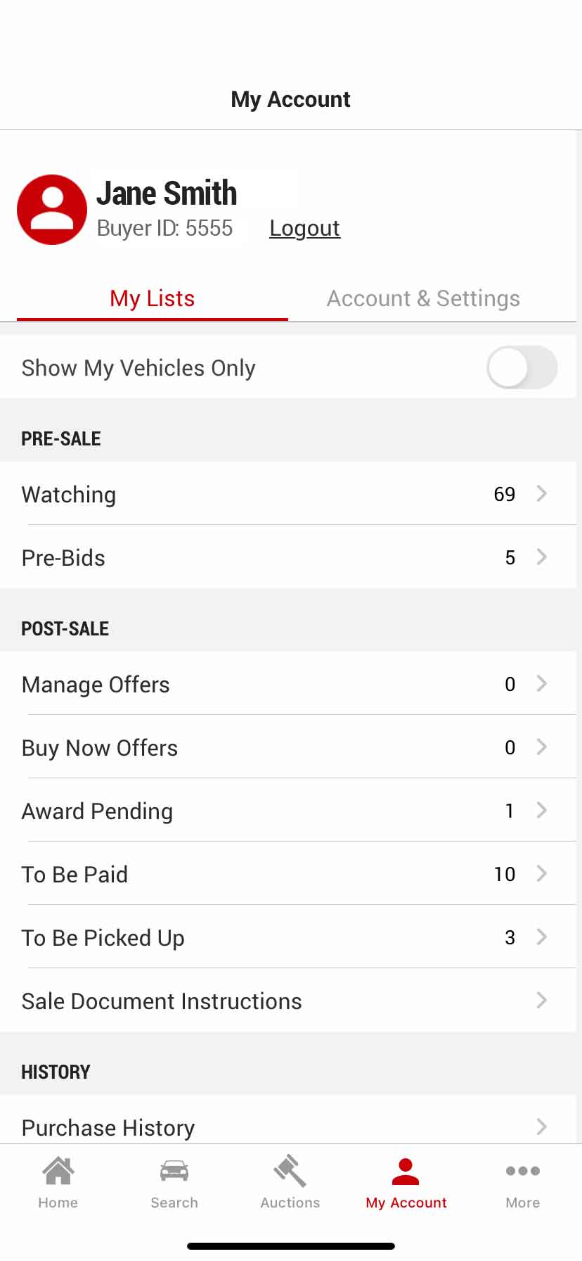
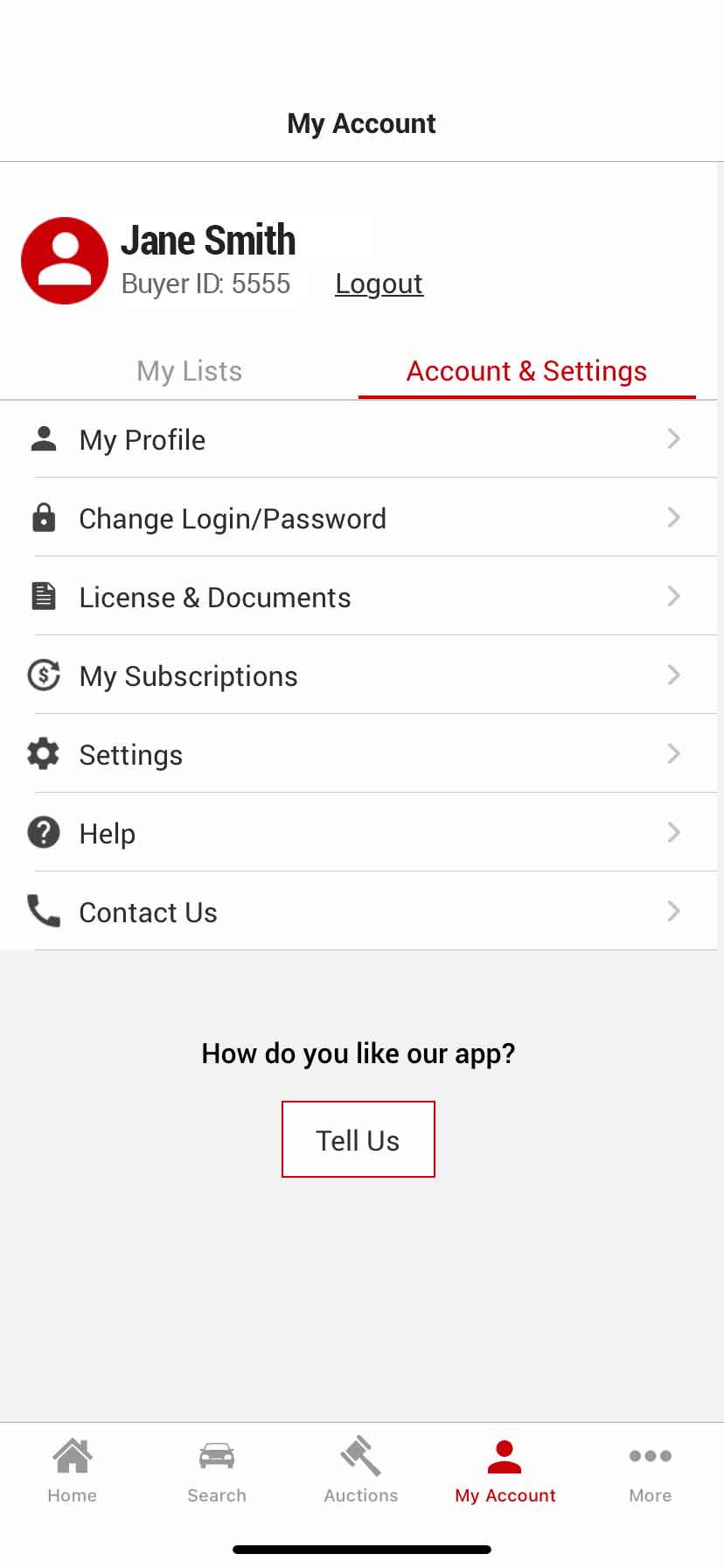
My Account page: Info architecture and UI upgrade
The My Account page contains user generated vehicle lists of interest and functionality for maintaining the user’s profile and account. We re-imagined the information architecture and UI for the page and made the following upgrades to make it easier for the user to find and manage this content and settings:
- Tab/Segment delineation – Similar content/functionality needed to be grouped and delineated so that the user could more easily find the content they are looking for. We therefore grouped the same into two tabbed segments: 1. My Lists, and 2. Account & Settings. This is a more intuitive design because when users come to this page they are looking to either manage their vehicle lists manage their profile/account. The user gains efficiency in this new UI in that they will no longer have to scan through all of the content on the page and determine whether the content is user generated content or Account/Profile settings related. The content has already been conveniently grouped for them.
Enlarged visual hit areas of the selections – We enlarged the selection visual hit areas throughout the page so that the user could more easily tap their target.
Figure 7.0. Illustration showing the redesigned My Account page with the My Lists tab selected.
- Tell Us button for capturing user feedback – One of our goals was to make it easy for users to leave general feedback about the app so that we could take said feedback into consideration during future iteration design initiatives. We conducted research and found that one of the most intuitive places to place a feedback button was in the My Account page. We therefore placed the button on this page with ample visual separation from the rest of the page content so that it is easy to find.
Icons paired with selection labels – We paired each selection with an an intuitive icon so that the user gained a little more clarity as to what content/functionality was behind the selection. We also felt that the icons contributed to a higher level of personification that made the page feel a little more friendly and enjoyable to use.
Figure 8.0. Illustration showing the redesigned My Account page with the Account & Settings tab selected, labels paired with icons, and the new Tell Us feedback button.
Activity Breakdown
Reflecting on this project as a whole, I completed work in the following areas: UI Design, Interaction Design, Visual Design, and Research. I’ve divided up the project into percentages based on these areas as illustrated in our analysis below: